Brochures
Even in the so-called age of electronic media, brochures are a terrific way to give existing and potential customers an overview of your business and your services. The ArtD'partment has designed brochures of many kinds, ranging from the traditional three-panel variety to high quality marketing presentation pieces. Considering rack cards instead of a brochure? See samples here.
Creative Floors
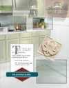
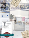
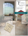
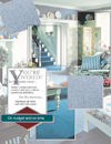
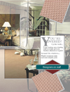
 The Creative Floors brochure makes use of an unusual number of panels and folds which provides a standard-sized brochure when folded. Open the brochure, however, and it includes double-paneled displays for each of several desired focuses in one cohesive package.
 |
 |
 |
 |
 |
 |
 |
FlexxPoint
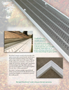
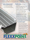
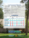
This 8.5" x 11" four page brochure was designed for consumers and contractors alike to provide an overview of a new gutter protection product.
 |
 |
 |
 |
GDM
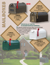
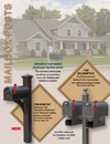
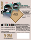
A local manufacturer of mailboxes and posts needed a brochure that could be used in multiple ways, including by independent product distributors as needed. The 8.5" x 11" "folder" design allowed the client to insert order forms, price sheets, and offer flyers on an as needed basis.
 |
 |
 |
 |
Growers Mineral Solutions
The Growers primary product is suitable for numerous applications, but indicators and instructions are different for each. To maintain a cohesive look for the different data required across a spectrum of typical agricultural products, a series of brochures was created. By maintaining the colors, styles, and design elements, the brand is emphasized even as the information is focused for the farmer. (Note that brochures requiring more data incorporated an additional panel, but maintained the same overall folded size and apperance.)
 |
 |
 |
 |
 |
 |
 |
 |
Harbor Light Landing
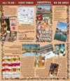
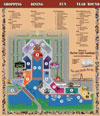
When this themed shopping plaza opened, the developer wanted a brochure that not only advertised the venue but offered a helpful guide to visitors. The ArtD'partment developed a map-folded brochure that featured images to show the unique beauty of the setting, a calendar of events, and detailed directions to make shopping as convenient as possible. Note also that the site map is a custom illustration by The ArtD'partment. (Note: full size images may take a moment to load.)
 |
 |
Plumbrook Country Club
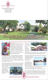
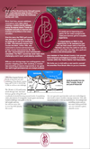
Plumbrook Country Club is a longtime fixture in the community. Though proud of its history, the organization came to The ArtD'partment for a brochure update. Our concept utilized updated images but held to the classic colors and logos long ago established. The multi-purpose brochure was designed to serve as a mailer as well as an informative print product.
 |
 |
Zimmerman Remodeling and Construction, Inc.
This multiple award-winning contractor wanted a portfolio that showed off prime examples of the company's work and which reflected their status. The ArtD'partment conceived and constructed a glossy brochure that emphasized both Zimmerman's expertise as well as their justifiable pride in hand-crafted, custom work. Even the built-in pocket (inside the back cover) kept to the theme!
 |
 |
 |
 |
 |
